Wednesday, March 7, 2007
Postcard sketch
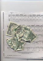
Johns Hopkins was a wealthy philanthropist, whereas Billie Holiday was a struggling musician. I am imagining a relationship between these two individuals, even though they are from different generations. The postcard on the top will feature 3 scenes, like that of a postcard from a place. The border will or background will have scans of crinkled up money. This postcard represents what Johns Hopkins wants Billie Holiday to do with her talent and fame. The other postcard, however, is what Billie Holiday ultimately does with her talent and fame- that is waste away in drugs and alcohol. The bottom postcard has a picture of looking down into a bottle. The design is going to come out in sort of waves or petals, like a beautiful flower- to show how amazing Billie Holiday's talent was, but the details show how she sometimes did not make the best decisions. Holiday only had abusive males in her life, so this is imagining Johns Hopkins as a strong male figure, who sees how amazing Holiday is.
SMP critiques
Rena-
This sculpture consisted of squares and rectangles of plywood that were attatched to wall so that they overlapped and protruded horizontally and sideways. Most of the rectangles were painted so that the lines went from a darker red to lighter pink toward the left side. Concerning the issue of space, Rena said that she wanted to have a continuity from left to right without actually connecting the rectangulars. Inspirations to this sculpture included Mondrian and Stella. As Lisa pointed out, however, there was no real sense of purpose concerning the formal qualities like Stella and Mondrian use. Rena did explain that she has always been interested in squares and rectangles because she is very attatched to city life. She mentioned looking at things and only seeing them as rectangles and squares. I agreed with Carrie when she said that the motion from left to right was successful, but the mortion up and back was not really working.
Ashely-
This artist was interested in collections from the household. She used personal photographs of collections from her family for a starting point. Her pieces in this critique included a textile made up of an embroderiey of a collection of spoons. The tarnished quality of the spoons was transformed into a colorful mix of threads by Ashely. I enjoyed this piece because I thought it excuded the household quality that I believe Ashley was looking for. Other pieces included another fabric work that was placed over a muffin tin for form and then oil tins were drawn within the circular forms. It was agreed upon by many people at the critique that this was the least successful. It needed more structure and planning. The last piece consisted of about 25 portraits of an array of buttons. These were displayed in individual shadow boxes made of paper. Ashley explained that she wanted to draw the buttons instead of displaying actual buttons because she is interested in the differences of things. The overall opinion I have of this project is that the scale and way she is showing these "collections" is kind of repetitive the actual collections they came from. Ashley didn't really have a reason for not just displaying the actual items. I found myself asking Why? throughout her whole critique.
Tom-
This photography project consisted of sets of black and white photographs that had formal qualities or subject matter in common. There were about a few dozen sets displayed on the wall. These sets were going to be made into a book with the sets displayed on facing pages. Tom said that he wanted the book because it was more "friendly". He wanted to show these connections within the set of photos to show people occurances that they might not ever notice without the aid of a photo. Insprirations of Tom's include Ralph Gibson and Elliot Irwitt. I was surprised to hear that none of these photos were staged or directed by Tom. They were all visual moments that Tom saw and then recorded. Some of the sets, however, work a significant amount better than others. The sets that had formal qualities in common were the most intriguing. Carrie pointed out that the white space meant to separate the two photos sometimes continued into the composition. Especially in one set that included I think architectural elements that included many triangles. I think there were too many sets and it was too much to take in. He might think about concentrating on finding only about 8 sets that were formally alike and not as obvious.
Subscribe to:
Posts (Atom)